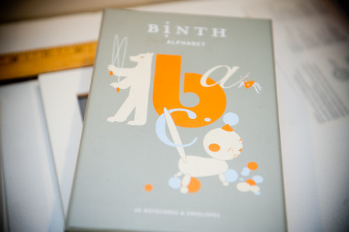
I bought these cute little correspondence cards at Winners ($5.99!) to use as decoration for Peanuts room.
So, I thought I would be smart and tested the layout in Photoshop before I went to Ikea to purchase the frame. On my computer, everything fit neatly into the frame I had chosen, and I had several options for the layout. Of course, I was too lazy to actually go and measure the cards, and assumed they were just 46s. Not only did the cards not fit into the 50cm x 70cm frame I purchased, they didnt even come close to my estimations, and so now I have 10 homeless cards.
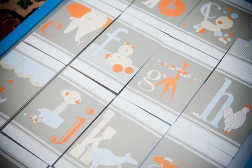
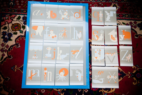
Of course, I could just go and buy a larger frame, but the thing is: the alphabet is not even. Twenty-six letters just doesnt divide evenly into rows, and always leaves you with an orphan line of letters. Hm. Maybe orphan isnt the right term to use exactly, but you get my meaning? You cannot full justify the alphabet. Well, I guess you could but then the bottom row would be all spaced out and it would look like those documents where someones trying to make it look longer than it actually is.
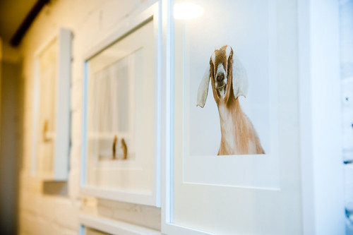
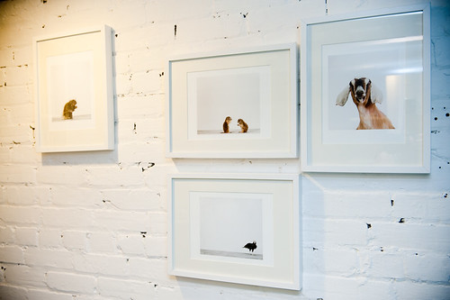
Okay. Enough with the word processing metaphors. At some point, Im going to have to get creative with the layout, so I figure I might as well just do it with the framing, and then maybe the little orphan letters wont look so alone. Im already into abstract framing and picture hanging, as I did with my Sharon Montrose prints (also in Peanuts room):

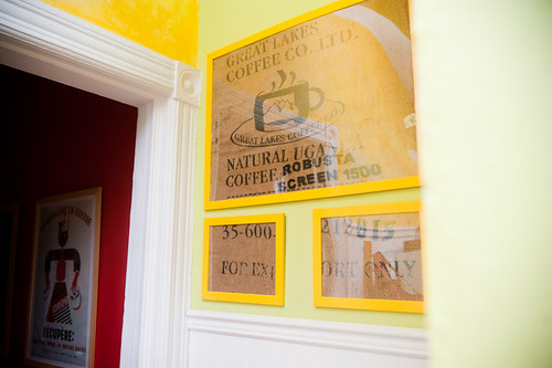
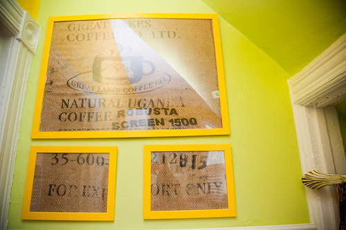
and as Ive done with my burlap coffee sack in the kitchen:
So now tell me, dear readers, given the Ikea Catalogue, what would you do? I could buy two smaller frames from the same series and hope all the cards fit. I could do the rest individually, but that could get expensive. Or I could do a combination of the two. Or perhaps youll say I should just get one large frame because my off-kilter picture hanging techniques have just gotten out of hand! (This may actually be the cheapest way to do it. It just seems so boring!) And then comes the question, how do I mat the pictures within the frame?
So what do you say?

So, I thought I would be smart and tested the layout in Photoshop before I went to Ikea to purchase the frame. On my computer, everything fit neatly into the frame I had chosen, and I had several options for the layout. Of course, I was too lazy to actually go and measure the cards, and assumed they were just 46s. Not only did the cards not fit into the 50cm x 70cm frame I purchased, they didnt even come close to my estimations, and so now I have 10 homeless cards.


Of course, I could just go and buy a larger frame, but the thing is: the alphabet is not even. Twenty-six letters just doesnt divide evenly into rows, and always leaves you with an orphan line of letters. Hm. Maybe orphan isnt the right term to use exactly, but you get my meaning? You cannot full justify the alphabet. Well, I guess you could but then the bottom row would be all spaced out and it would look like those documents where someones trying to make it look longer than it actually is.
Okay. Enough with the word processing metaphors. At some point, Im going to have to get creative with the layout, so I figure I might as well just do it with the framing, and then maybe the little orphan letters wont look so alone. Im already into abstract framing and picture hanging, as I did with my Sharon Montrose prints (also in Peanuts room):


and as Ive done with my burlap coffee sack in the kitchen:


So now tell me, dear readers, given the Ikea Catalogue, what would you do? I could buy two smaller frames from the same series and hope all the cards fit. I could do the rest individually, but that could get expensive. Or I could do a combination of the two. Or perhaps youll say I should just get one large frame because my off-kilter picture hanging techniques have just gotten out of hand! (This may actually be the cheapest way to do it. It just seems so boring!) And then comes the question, how do I mat the pictures within the frame?
So what do you say?
VIEW 4 of 4 COMMENTS
maike:
Or, add the numerals and have a perfect 6x6 layout. Or, some scissors action on the white margins top and bottom of the cards which looks like it will give you square cards and more of a tile appearance. The arachnid will be a cool learning discussion. Do they have the frame in a matching orange?
obd:
what about one really long and skinny frame? maybe you could dry mount everything to a board and then have it all coated in resin. or is that not enough of a frame?